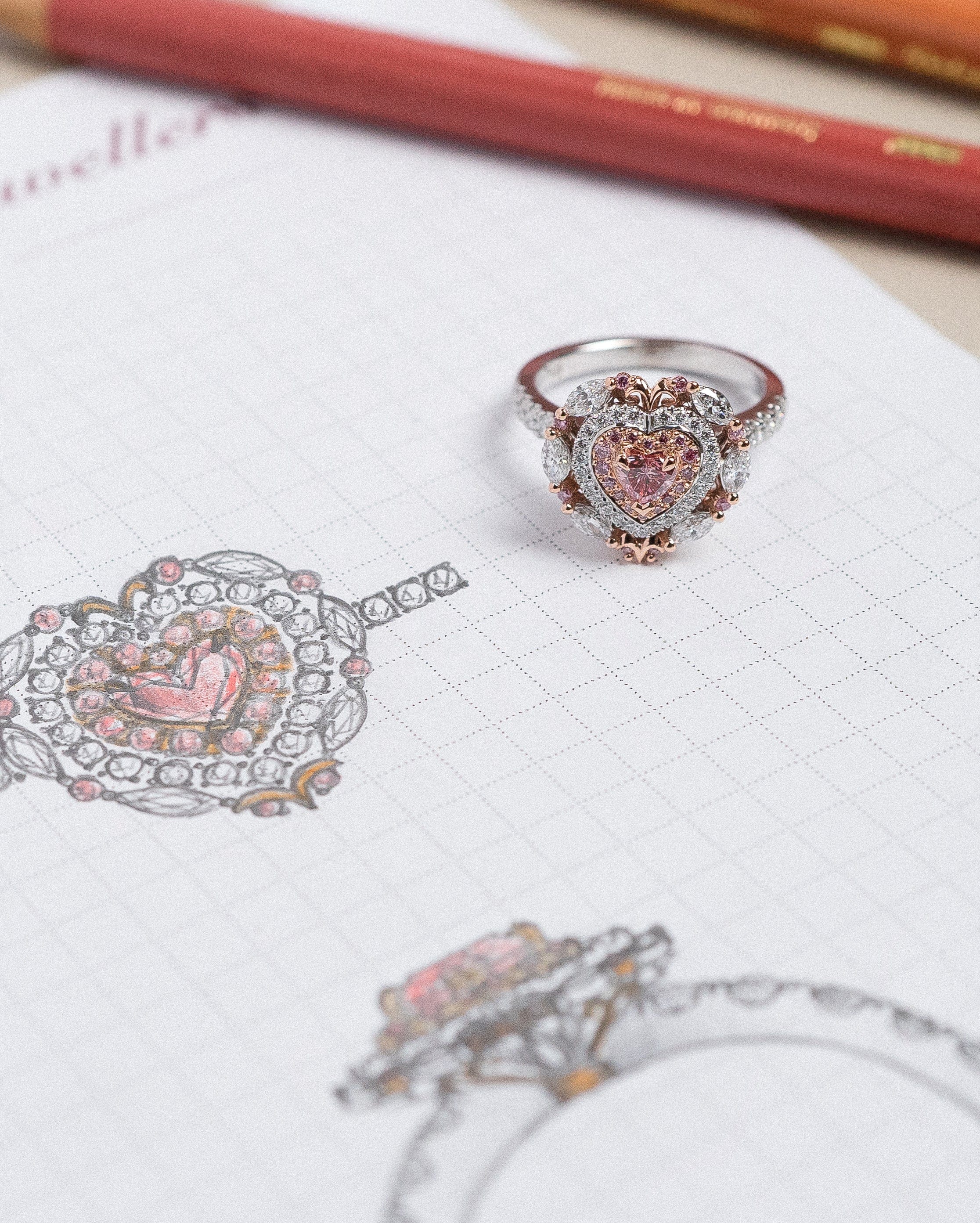
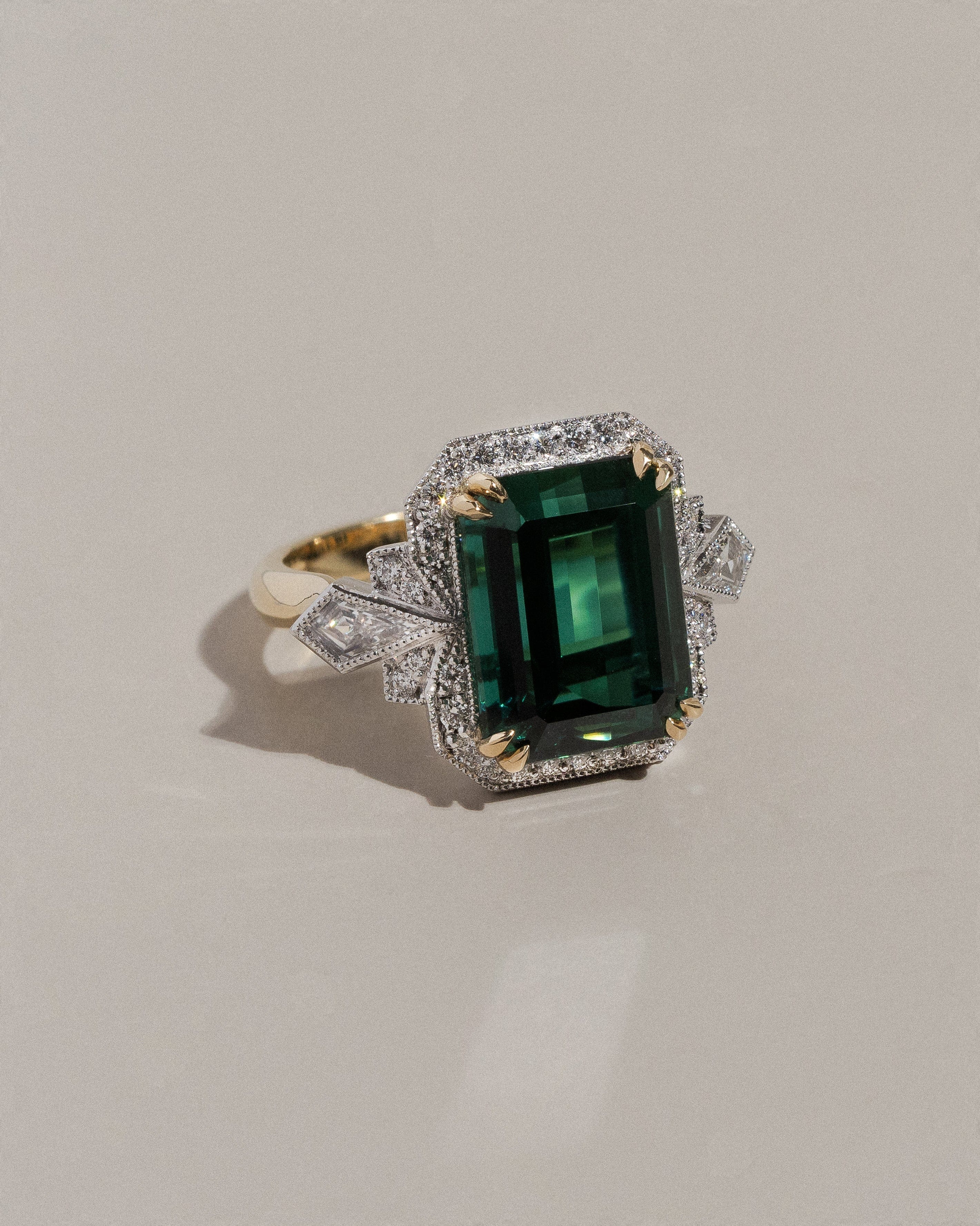
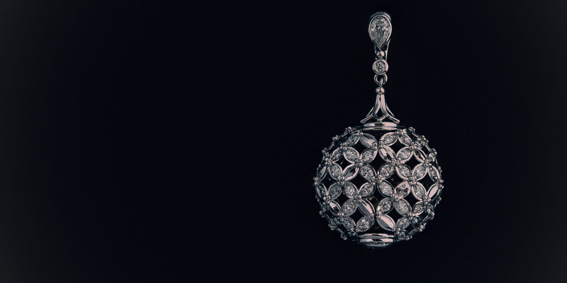
Each year, the LifeFlight Gala presents an opportunity to create something truly extraordinary in support of a remarkable cause. For the 2026 gala, Hogans proudly unveiled Fleur de Lune, a one-of-a-kind pendant accompanied by an original gouache painting, thoughtfully designed and handcrafted exclusively for the event.
Inspired by this year’s "Mirror Ball" theme, Fleur de Lune is a celebration of light, movement, and artistry. From the earliest sketches through to the final setting of each diamond, every stage of the piece's creation was guided by a shared commitment to craftsmanship, innovation, and attention to detail. The pendant itself serves as a tribute not only to timeless design, but also to the lifesaving work of LifeFlight, with subtle elements woven throughout that honour the organisation's enduring impact.

To offer a glimpse behind the scenes, we spoke with the designer, craftspeople, and specialists involved in bringing Fleur de Lune to life. Their insights reveal the creativity, technical expertise, and collaboration required to transform a concept into a truly exceptional heirloom.
The Designer & Painter: Keelie
Q: Fleur de Lune is a beautifully expressive name. What inspired the concept behind this piece, and how did the design first come to life?
A: In previous years, Hogans have crafted artful and extravagant rings for the LifeFlight Gala, and so for this year’s piece, we wanted to focus on something that was wearable, but that differed from our past designs. This led us to a pendant.
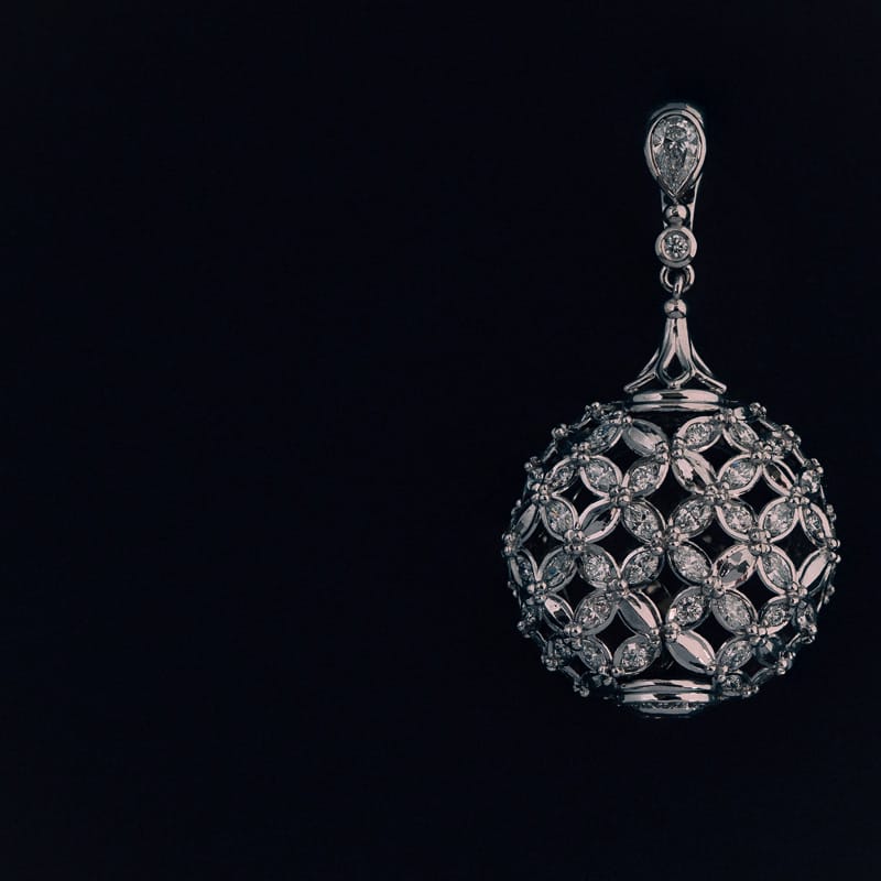
The theme for the 2026 LifeFlight Gala was “Mirror Ball”, and from the very beginning, we wanted to create a piece that not only reflected this theme beautifully but was also a timeless design to be treasured long after the evening concluded. While the disco ball served as an obvious point of inspiration, our goal was to reinterpret its brilliance through a lens of refinement and sophistication. The soft curves of the marquise-cut diamonds introduce a distinctly feminine elegance, allowing the piece to honour the theme while remaining timeless in its appeal.
As a nod to LifeFlight, the charity we are incredibly proud to support each year, the four marquise-cut diamonds arranged in an outwardly radiating formation represent the rotors of a helicopter.
Titled Fleur de Lune, meaning “Flower Moon” in French, the name was chosen to evoke elegance while referring to the moon’s natural ability to reflect light, much like the brilliance displayed by the diamonds throughout the pendant.

Q: Can you take us through the creative journey from the first sketch to the final pendant?
A: The original design for this piece differed greatly from the final pendant, with several changes made throughout the design process to balance practicality while remaining true to the key design principles. The initial concept featured a teardrop-shaped silhouette; however, the desired pattern compromised the overall aesthetic. This ultimately led to the softer, rounded form seen in the finished piece, allowing the pattern to flow seamlessly along its gentle contours.
Alongside this, we initially planned for the entire pendant to be set with marquise-cut diamonds. Visually, this created too much repetition and did not achieve the desired light performance. To address this, we introduced petals of facetted white gold alongside pave-set round brilliant-cut diamonds. This created greater textural interest while enhancing the overall brilliance of the design.
From the onset, our intention was to achieve a sense of purposeful asymmetry. I believe this was realised in a way that feels distinctly contemporary, while remaining true to the heritage-inspired heirloom pieces for which we are renowned.

Q: As the piece evolved, which design details remained central to your vision?
A: A key focus within the design was ensuring that not only the diamonds sparkled, but that every element of negative space felt intentional and considered. The spacing between the marquise-cut diamonds subtly forms delicate four-pointed star silhouettes, creating hidden moments of symbolism and intrigue. This celestial influence continues through to the reverse of the pendant, where a star motif has been thoughtfully incorporated as a finishing detail. Incorporating these details through the design introduced an ethereal quality, proving that it is often the smallest details that leave the most lasting impression.
Q: As both the designer and the artist behind the accompanying painting, how did you approach translating the piece into art?
A: The illustration is completed after the jewellery has been finalised, allowing for complete accuracy in capturing its final form, light performance, and intricate detailing as it truly exists. Working post-completion also deepens the connection to the piece itself, providing the opportunity to observe how the design comes to life once crafted, rather than simply how it was initially envisioned on paper or screen.
My medium of choice is gouache, sitting somewhere between a watercolour and acrylic paint, allowing for rich opaque layering. In this particular work – a monochromatic composition of black, white, and grey tones – gouache allows depth to be introduced through subtle undertones of blue and violet.
Q: What details were most important for you to capture within the painting?
A: Diamonds are notoriously challenging to paint due to their incredible brilliance and ability to refract light in a spectrum of vivid colours. While many artists render diamonds using only white and grey tones, I incorporated subtle flashes of colour to reflect some of the radiance seen within the pendant itself.
Alongside this, Fleur de Lune is a thoughtful compilation of stylistic elements, and I wanted to ensure each one was highlighted within the artwork. To achieve this, I chose a blueprint-style composition, allowing every aspect we worked tirelessly to perfect to be showcased and celebrated.

Q: What aspect of Fleur de Lune are you most proud of?
A: I am incredibly proud of the camaraderie within our team. From the earliest design discussions, we set out to create something truly distinctive, something unlike anything we have crafted before. Every member of the workshop embraced the project with enthusiasm and generosity.
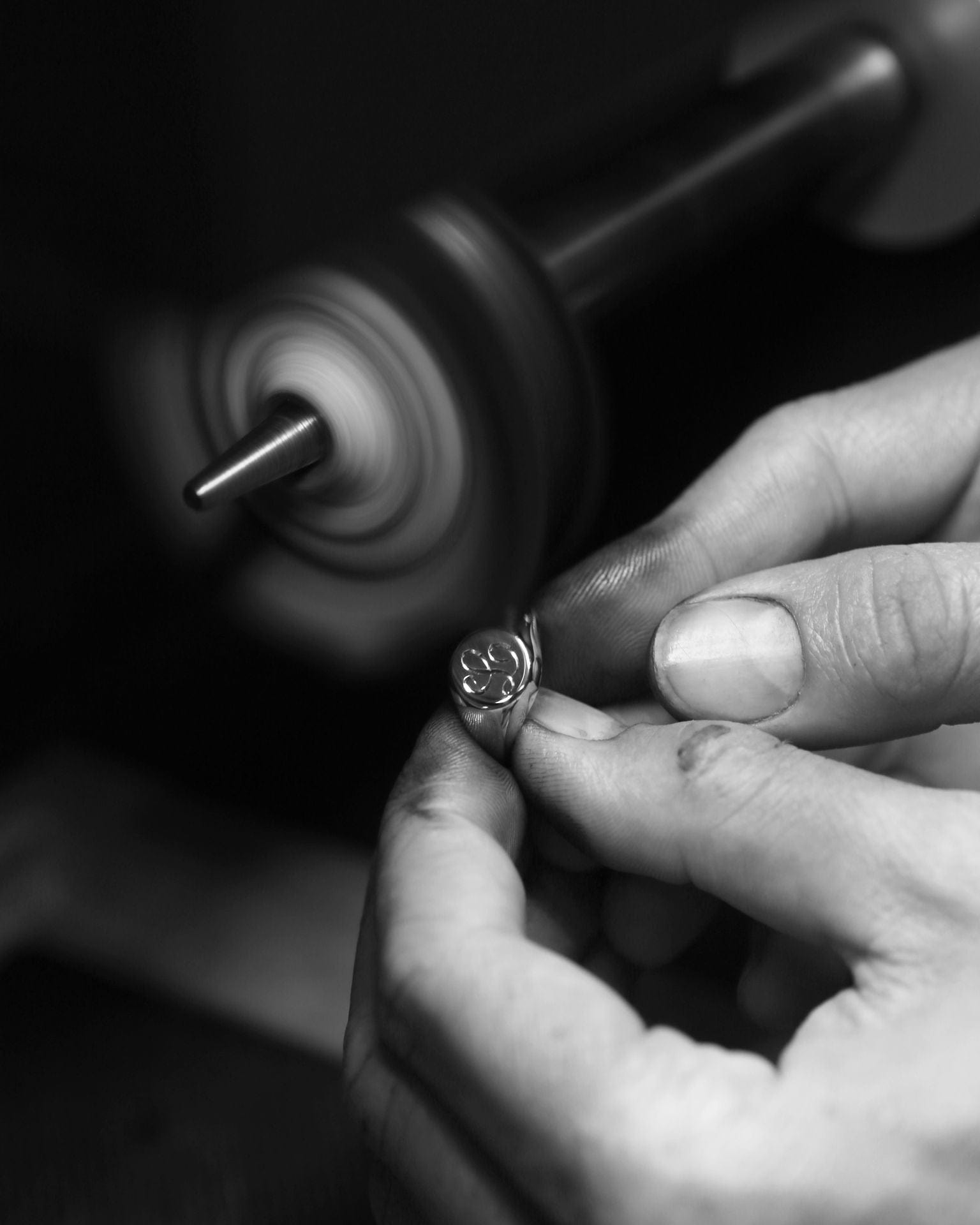
A team of jewellers working on a piece of this intricacy naturally diverts time away from day-to-day production, so having the broader workshop support the tasks surrounding Fleur de Lune ensured that Hogans could continue operating as usual. While not every jeweller had a direct hand in the creation of the pendant, each person played an important role in allowing us to dedicate the time and attention required to bring such a special piece to life.
The painting was also undoubtedly a highlight. Not only do I thoroughly enjoy the process from start to finish, but I am incredibly pleased with the final result, particularly when paired with the beautiful framing completed by ARTSHOP. Together, they allow us to tell a richer story about Fleur de Lune and reinforce the heirloom quality we strive to create throughout every bespoke journey.
The CAD Designer: Nolan
Q: How did you approach bringing Keelie’s vision for Fleur De Lune into the digital design space?
A: Each year, we are privileged to create a one-of-a-kind piece for the LifeFlight Gala. Our objective is always to transform an ambitious creative vision into a wearable and structurally sound design while ensuring each year’s creation possesses its own unique identity.
To achieve this, the process is broken down into manageable stages that guide the evolution from concept to completion. It begins by asking ourselves what the focal point of the piece should be and what story we want it to tell. From there comes extensive CAD development, collaborative brainstorming amongst the team, and countless refinements to ensure every detail is considered and perfected.
Q: Were there any particularly intricate elements of the pendant that required innovative solutions during the CAD process?
A: Transforming a two-dimensional sketch into a three-dimensional piece requires a significant amount of problem-solving to ensure the original vision remains intact. The complexities of Fleur de Lune were multifaceted, incorporating marquise, round brilliant, and oval-cut diamonds, a domed profile, and the carefully considered negative space.
Bringing a repetitive pattern into a three-dimensional form while maintaining consistency throughout the dome-like shape presented a unique set of challenges. Overcoming these required extensive collaboration and careful planning throughout the design process.

Q: Which part of the CAD development are you most pleased with in the finished piece?
A: Like with many creative projects, the anticipation of seeing the finished result is often the most rewarding part, particularly when it is a design you feel deeply proud of. Occasionally, a finished piece may not align perfectly with the original vision, so seeing every element of Fleur de Lune come together so seamlessly was incredibly gratifying.
The Jeweller: Tim
Q: What was the most technically demanding aspect of crafting Fleur De Lune?
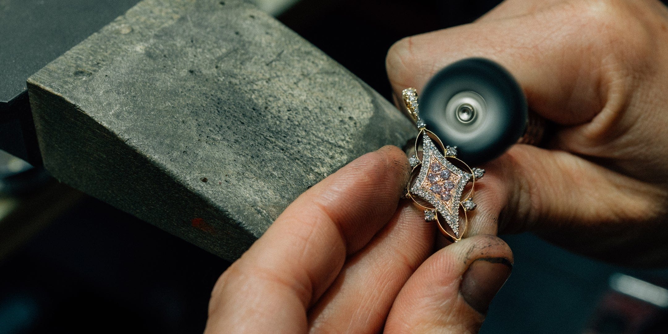
A: Whilst the construction of the finished pendant was not overly demanding, the greatest challenge lay in translating the original concept from sketch to reality. In the early stages, it was essential that Keelie, Nolan, Leo, and I worked closely together to ensure the intent of the design was preserved throughout each phase of development. That collaborative approach was instrumental in bringing Fleur de Lune to life exactly as envisioned.
Q: What details of the finished piece are you most proud of?
A: Like many others involved in the project, seeing the finished piece is the most rewarding part of the journey. Watching each individual element come together within a wearable work of art is incredibly satisfying. The way the finished pendant captures and reflects light creates a remarkable sense of brilliance and movement. Combined with the precision of its construction and the quality of its finish, it is a piece we are all immensely proud of.

The Setter: Leo
Q: What were your favourite and most challenging aspects of working on Fleur De Lune?
A: The addition of petite channel-set round brilliant-cut diamonds bordering the oval-cut diamond at the base of the piece was an unexpected detail that elevates the pendant beautifully and became one of my favourite aspects of the design.
The domed profile of the pendant presented a unique set of challenges and intricacies. Ensuring each diamond sat perfectly within the repeating pattern required exceptional precision, concentration, and consistency throughout the setting process.

Q: Is there a particular detail within the setting work that you are most pleased with?
A: As mentioned, the pattern throughout the Fleur de Lune was highly sophisticated, and I am pleased with how seamlessly the finished result came together. Achieving absolute consistency in the angle and positioning of each diamond was paramount.
Maintaining even tension throughout the design ensured the pattern flowed effortlessly across the pendant, resulting in the refined finish we were striving to achieve.
The Bespoke Framer: ARTSHOP Toowoomba (Cherylyn)
Q: Many people see a frame as simply a finishing touch, yet it plays a significant role in the creative journey of how an artwork is experienced. How do you determine the right framing solution for a piece, and what qualities were you hoping to highlight within Fleur de Lune?
There are many considerations regarding custom framing advice. Our clients have at least one goal, and it is our role to draw this from them and understand it. The goals can include artwork preservation through responsible framing, updating framing to suit a new interior, simple decoration alone, and more. We recognise that we can achieve multiple goals for our clients in one integral framing solution, and we guide our clients through that process. The process can be compared to attending a reputable manufacturing jeweller, like Hogans, with the goal of collating an heirloom collection of precious stones into a piece of jewellery. Imagine the extensive options for the jewellery designer! The client in this situation is reliant upon the expertise of the jeweller. The jeweller understands the construction methodologies, knows the materials selection criteria to achieve a sustainable and beautiful result, and very fortunate communities like Toowoomba have jewellers like Hogans who are very good designers as well as makers. ARTSHOP custom framers are experienced and expert in conservation-standard custom framing, knowledgeable about artwork and object types, and excellent framing designers. We each have our own aesthetic and style preferences, and we will draw from these to guide our clients through the custom framing design process. Personally, my custom framing design ethos is to firstly preserve the piece, that is, facilitate artwork treatment if necessary, and subsequently design a framing solution which is an archivally sound storage unit. Aesthetically, I seek to extend the aesthetic elements of the artwork or object with its framing, so that the framing is a visual extension of the artwork.
The Fleur de Lune jewel illustration by Keelie spoke to us about its framing! Such a subtle and subdued colour palette, antique in its styling, like an architect's blueprint. Lucinda, Evan and I discussed our goals for the framing: preserve the work, beautify the work with materials, forms and colours that extend the artwork and do not compete with it, and also use this opportunity to demonstrate our skills. The stunning jewellery design illustration deserved no less!
Q: When framing an original artwork intended to be treasured for years to come, how do you balance aesthetic considerations with the need for long-term conservation and are there specialised materials that you use to achieve this?
Aesthetic considerations and long-term conservation considerations do not need to compete. Conservation-standard materials are readily available; the diversity of colours, finishes, and textures are quite limitless! Knowing how to use these materials to enhance an artwork is the role of a skilled designer; knowing how to use the materials responsibly to preserve the artwork is the role of a skilled maker. Expertise in both design and conservation-standard making is critical. The principles of conservation framing are summarised thus: 'to keep from harm, decay or loss'. That means the artwork must retain its complete integrity. This can only be achieved through using reversible mounting methods, pH-neutral materials (acid-free is not the same as pH-neutral), UV-filtering glazing types, strong, spacious construction design and advice regarding hanging and storage. ARTSHOP's first and foundational priority is to preserve any piece that is entrusted to us for custom framing. People do not spend money on framing with anything other than the expectation that the framing activity safeguards their artwork or item to be framed. People are making an investment. Not all framing businesses respect this and are content to make a sale, regardless of whether their material selections and framing methods will harm an artwork. I estimate that at least 50% of our work at ARTSHOP is correcting the harm caused to artworks that have been irresponsibly framed previously at some point in the life of that artwork.
We are not elitist; we will always provide our clients with full information about the 'health' of their artwork, whether treatment is required or not, and provide help and guidance about their options. It may be that the work needs to be conducted in stages in order to be achieved without compromising a family's budget - restoration first, conservation framing second, for example - and we will always help our clients to achieve an archivally sound and beautiful outcome.

Q: Every bespoke framing project follows its own journey. What was the process of bringing Fleur de Lune from artwork to finished presentation, and what level of time and craftsmanship is typically involved in achieving a result of this standard?
I mentioned earlier that Keelie's illustration of Fleur de Lune spoke to us about a beautiful design aesthetic. It's great when an artwork is just so pretty, so intact in its aesthetic. It simply asks, "just make me more like me!" Keelie is clever; she could have represented this jewel in plenty of different ways, but her instinct to lean in to a vintage, almost architectural-simplistic style for the illustration was inspiring. Hogans invested weeks into making this stunning pendant, and Keelie's wonderful illustration was only available to us four days prior to the LifeFlight Gala, so we asked for inspiration images and concepts to be made available to us as soon as Hogans could provide them. Based on these images, we developed a fairly clear design direction: antique styling including Italian warm silver-leaf Deco-era moulding, pH-neutral warm pewter Suede matting, generous proportions, UV-filtering and zero-reflection glazing. We kept the colour palette subdued, consistent with the illustration, to extend the illustration's aesthetic and not compete with it. The palette was our Lucinda Steele's selection, and we determined the perfect proportions together. Our Evan Hollis and I worked together on the construction over two days, including frame building, mat cutting and lining the mat window with a miniature frame to match the feature frame. I continued to perfect it over the weekend, adding hand-colouring to the background of the frame moulding to increase the contrast subtly. As the framing solution continued to materialise, I was inspired by the illustration to cluster additional decoration to each frame corner, and our friends at Range Antiques helped me to achieve this by supplying a section of antique silver bracelets with the perfectly sized beads, which I applied to the frame. The full construction method includes ensuring the mat is sufficiently elevated above the backing, such that the glazing and archivally-hinged illustration will never touch, and includes an invisible channel spacer between the mat and glass, providing ventilation space. Once the construction was complete, over the weekend, we observed the framed illustration over a further 24 hours, and I built a protective and attractive box to ensure that the lucky and very happy winner of the Hogans Balloon Pop Jewellery Prize could safely handle and transport their original framed illustration home after the exciting LifeFlight Gala.
Fleur de Lune represents far more than a bespoke jewellery piece. It is the culmination of countless hours of design, craftsmanship, artistry, and collaboration, brought together by a team united in the pursuit of creating something truly meaningful.
We are incredibly proud to support LifeFlight through the creation of Fleur de Lune and grateful to every individual who contributed their expertise throughout the journey. It is our hope that this piece will be treasured for generations to come, serving as a lasting reminder of both exceptional craftsmanship and the extraordinary work carried out by LifeFlight each and every day.