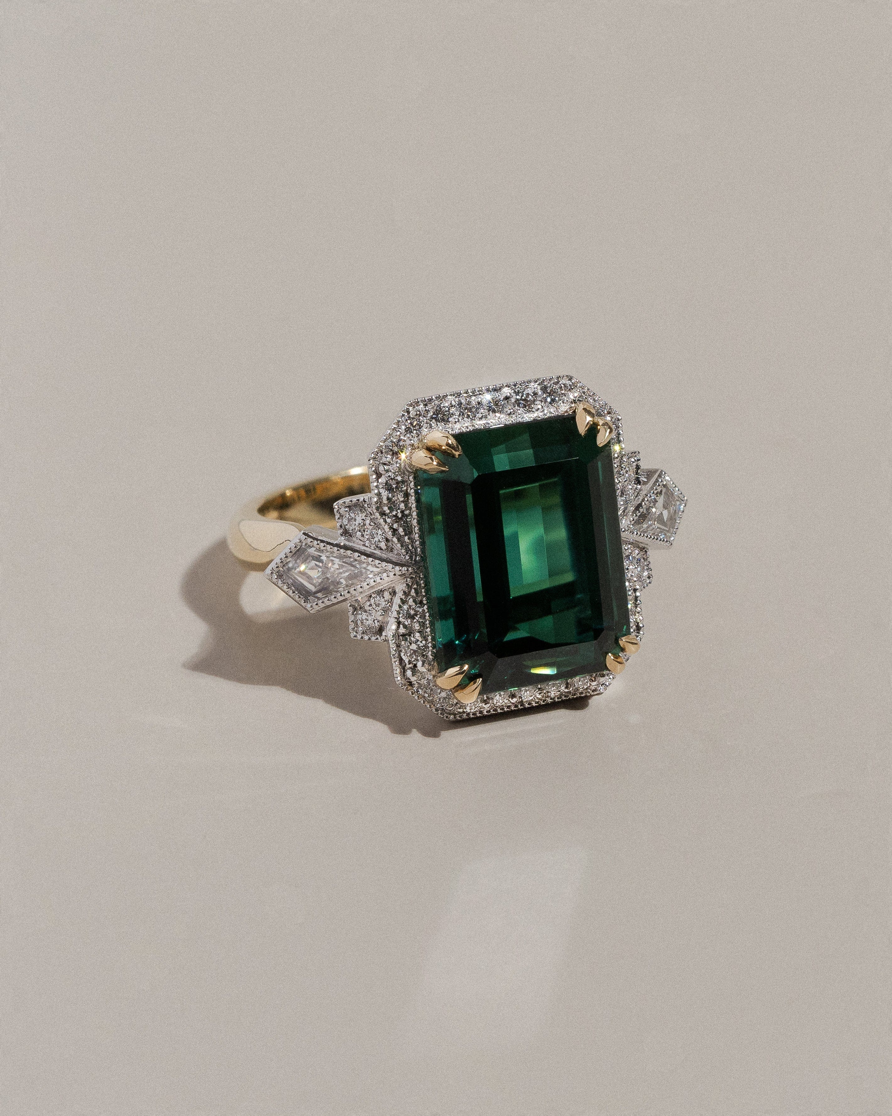
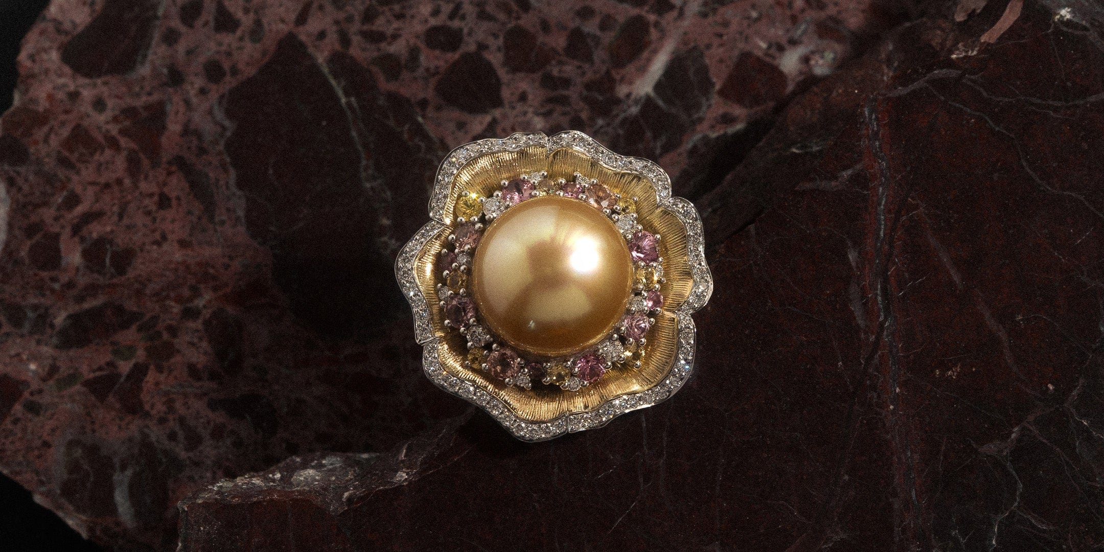
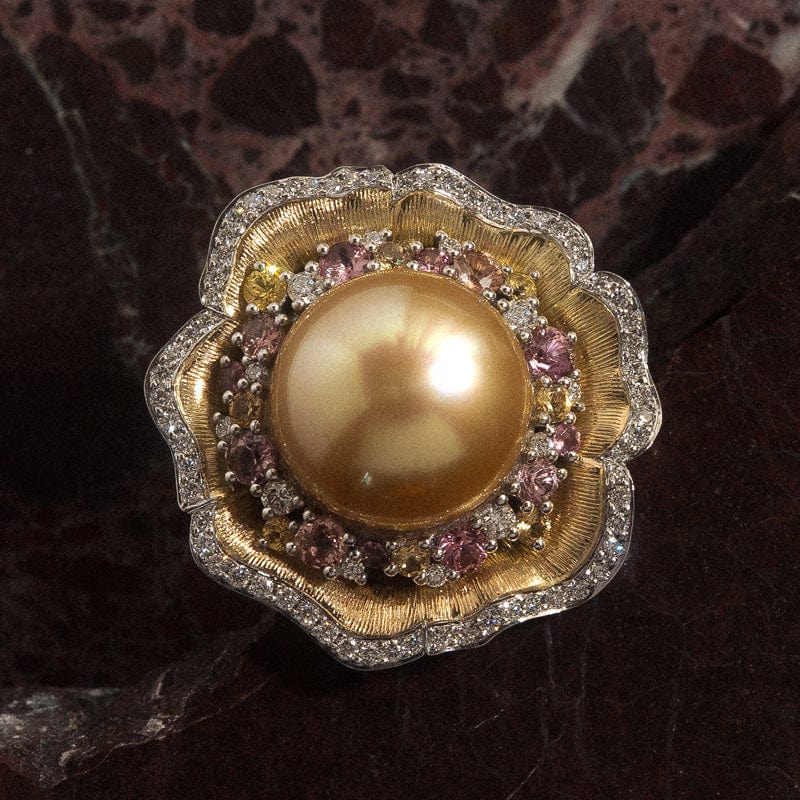
This month, the spotlight is on a truly special creation: an exquisite bespoke ring thoughtfully designed, assembled, and crafted in the Hogans workshop. As a proud sponsor of this year’s Toowoomba LifeFlight Gala, our team had the honour of creating a one-of-a-kind piece to feature in the event’s much-anticipated annual balloon pop. The lucky winner, Ursula Dodds, is now the proud owner of this one-of-a-kind piece. To accompany the ring, our award-winning jewellery designer, Keelie Skou, illustrated and hand-painted a gouache watercolour artwork, capturing the piece’s elegance and intricate detail. Designed as the signature jewellery prize for the LifeFlight Gala 2025, the ring not only reflects the gala’s radiant gold theme but also symbolises its deeper mission of supporting the lifesaving aeromedical services provided by LifeFlight. The gala is a prestigious annual black-tie event that gathers hundreds of guests in celebration of community spirit, resilience, and the incredible work of LifeFlight’s rescue teams. More than just a glamorous evening, the event plays a vital role in raising essential funds to ensure emergency medical care remains accessible throughout the region.
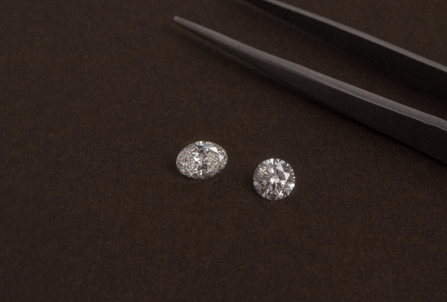
Designed by Hogan's award-winning, qualified jeweller, Keelie, this ring is crafted in 18k yellow and white gold and features a lustrous golden South Sea pearl at its core, representing the colour hue of the LifeFlight Gala 2025. Surrounding the pearl is a decorative cluster of sunset-hued sapphires, combined with a contrast of high-quality round brilliant cut white diamonds for added brilliance. The floral-inspired design gives the piece a soft, organic elegance, the pearl and surrounding gemstones representing the centre of a flower, while the sculpted gold setting forms its delicate petals. Completing the design, a pave-set row of white diamonds borders the centre piece, enhancing its radiance and refinement. The ring is finished with a solid, domed yellow gold band. This unique Hogan's piece is one to be cherished for generations by one lucky winner.


The Designer: Keelie
Q: To start, can you share the inspiration behind this bespoke ring? What served as your main source of creative direction?
A: The LifeFlight Gala’s colour theme this year is gold. Lachlan and I really wanted to incorporate rich gold elements into the design without the ring feeling overwhelmingly gold. We simply could not resist the illustrious allure of the South Sea Golden Pearl. The slight button shape suited perfectly for a ring, and with the subtle shine from soft pink hues, we decided we must pair it with our signature Hogans Padparadscha pink and peach sapphires. The lemony hues of some feature yellow sapphires, combined with a speckling of our best diamonds, adding a pop of zing to this year’s LifeFlight Gala Jewellery Prize.

Q: What message or symbolism did you intend this ring to carry for those who wear or see it?
A: I wanted to create a piece that feels both fun and feminine, something that effortlessly complements a variety of occasions. Whether worn at lively cocktail parties, relaxed brunches, or simply enjoyed at home catching the subtle sparkle of light under the bedside lamp, this ring was designed to bring joy and elegance to everyday moments. My intention was for the wearer to feel perpetually glamorous, confident and radiant no matter where they are or what they are doing. It is a piece that invites you to embrace your own sense of style and sparkle, making every day a little more special.
Q: Can you walk us through the design process, from the initial concept to the final design?
A: We started with the golden South Sea pearl and built upon that as the foundation of the design. Our aim was for the ring to evoke images of both coral reefs and garden beds, capturing the delicate beauty of nature. I carefully handpicked the collection of sapphires to reflect the soft, luminous quality of the pearl. These sapphires truly bring life and vibrancy to the piece, and I was very conscious that they needed to be of the highest quality. To add further depth and contrast, we enhanced the polished gold on the outside of the petals by incorporating a textured finish on the inside.
Throughout the design process, we created many drawings, some of which teetered on the edge of impracticality. Our goal was to create not just a ring, but a true work of art. This particular design was part of our very first set of drafts, and ultimately, Lachlan and I both gravitated towards it. Sometimes the initial, more sophisticated concepts surprise you and prove to be the most successful.

Q: Approximately how long did it take you to design the piece in full?
A: I don’t ever see this part of the job as a timed component. I try to let my designs flow naturally, allowing inspiration to come when it’s ready rather than forcing it. Sometimes, the best ideas emerge unexpectedly, even when I’m working on something completely different. The design process is gradual and organic, developing over time as I reflect and refine each detail. I like to sit with a design, observing and considering it from every angle, until I know it is absolutely, one hundred percent perfect.
Q: What are you most proud of with this design?
A: I just love how it feels to wear. The band is incredibly comfortable, especially considering the size of the ring. It sits perfectly on the finger without feeling bulky or heavy, allowing it to be worn effortlessly throughout the day or evening. Comfort was a key consideration in the design, and I’m thrilled that this piece combines both striking beauty and everyday wearability so seamlessly.
The CAD Designer: Nolan
Q: Can you walk us through the digital design process behind this ring? Were there any features that required special attention?
A: The entire piece presented quite a challenge to CAD due to its complexity. The variety of gemstones and the organic shape of the petals required a completely new approach to stone placement. Initially, I had to space the stones out on a flat surface before transforming them into the curved structure of the ring. Each of the six individual petals has its own unique shape and structure, which meant I had to model them separately with great precision. Several variations were explored to finalise the design, particularly to accommodate the mix of stone shapes and sizes. The final layout took a few iterations to get exactly right, and I spent the better part of a month refining the CAD model. The ring is crafted with a thick, solid band that gradually transitions from 3 millimetres at the base to 4 millimetres at the top to support the substantial weight of the design while ensuring comfort and durability.
Q: Were there any unique technical or aesthetic decisions made during the design stage that caused challenges during the CAD process?
A: Yes, definitely. One of the most significant technical challenges was spacing the gemstones along the curved petal structures. Because of the organic nature of the design, traditional stone-setting layouts were not suitable. I had to create a new method to map the stones, beginning with flat positioning and then adapting that to the curves of each petal. The asymmetry of the petals meant that every one of them had to be individually modelled rather than copied. Aesthetically, it was challenging to balance the variety of stone shapes and sizes while maintaining visual flow and symmetry. Structurally, it was also important to ensure the band could support the weight of the design without compromising elegance, which required thoughtful adjustment of the band’s width and overall proportions.

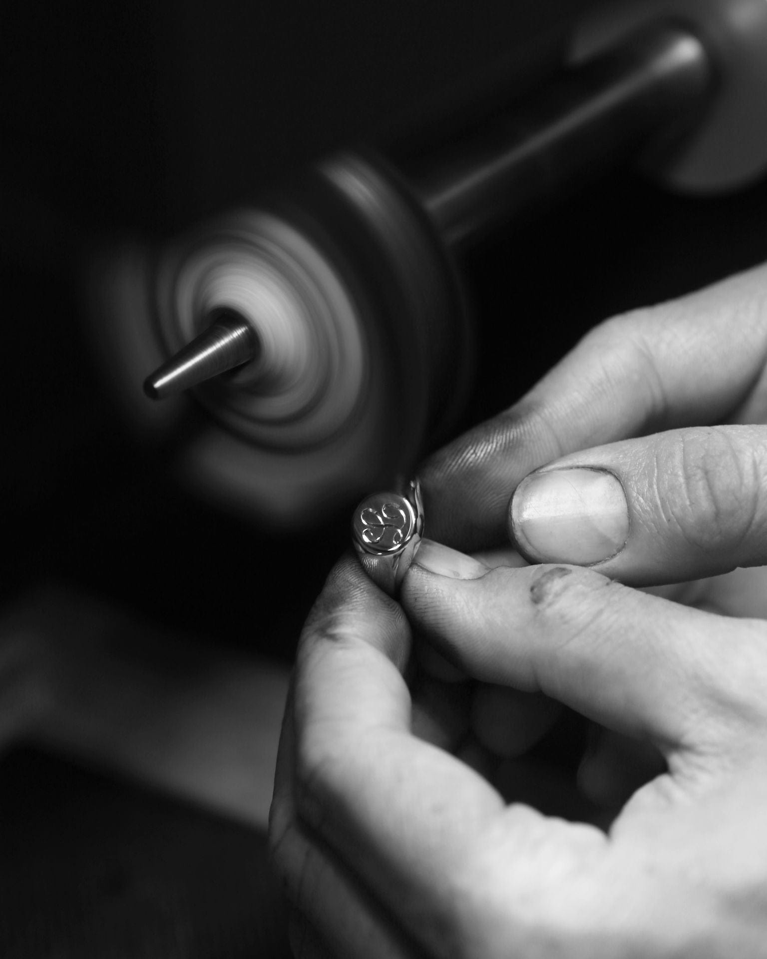
The Jeweller: Tim
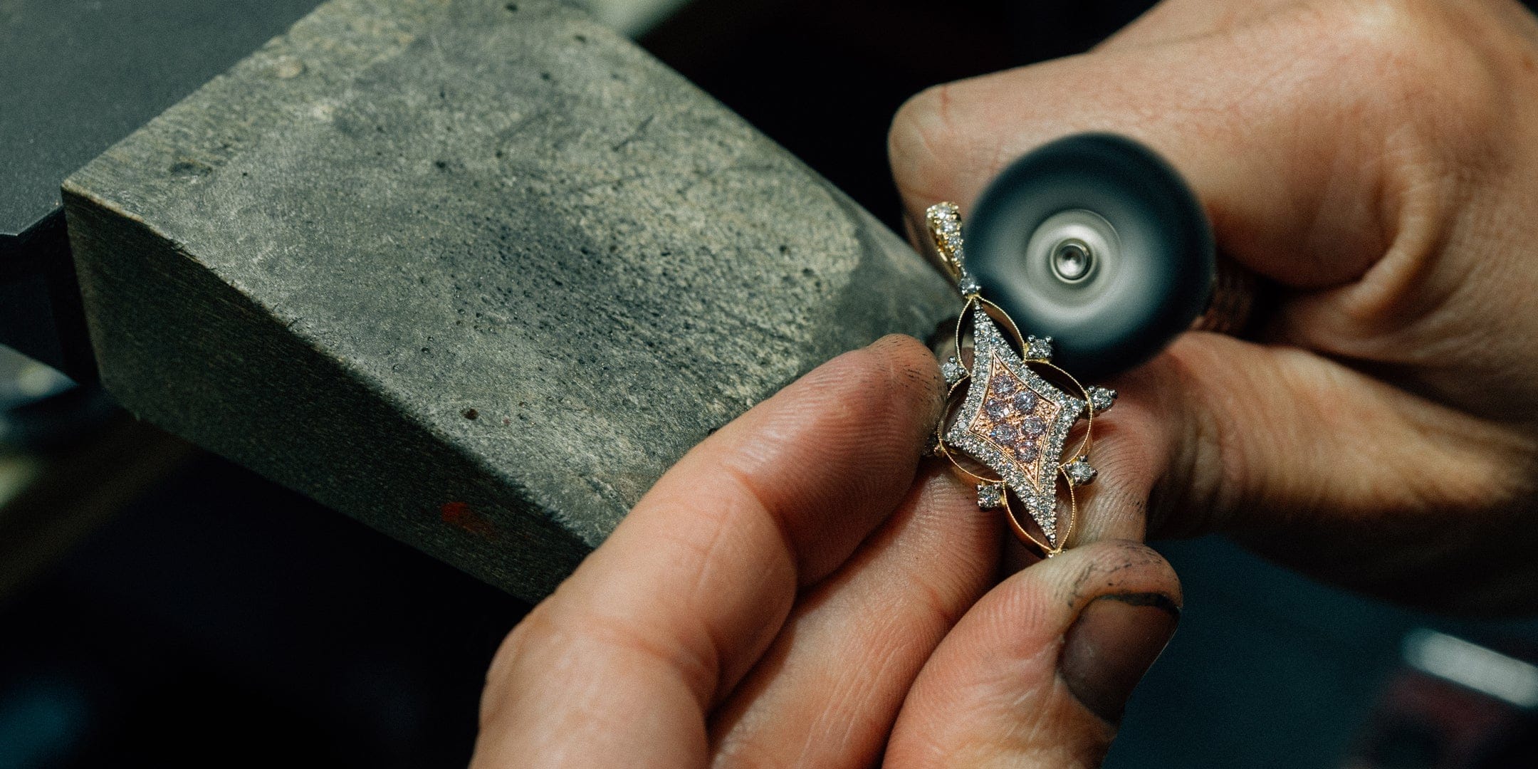
Q: What was the most intricate part of the ring’s construction, and how did you ensure it met the highest quality standards?
A: The most intricate part of the ring was the line engraving on the inside of the petals. This delicate detail required precise craftsmanship and a steady hand to ensure each fine line was perfectly executed. The engraving adds depth and texture to the design, creating a subtle contrast against the polished gold exterior. It’s a hidden feature that invites closer inspection and highlights the care and artistry that went into every aspect of the piece.

The Setter: Leo
Q: Were there any challenges when working with such an intricate design?
A: One of the challenges I faced while setting the ring was drilling without going all the way through the quite thick material, as I was concerned about breaking the drill bit. The task was made more difficult due to the angle of the setting, which required extra precision and control. To protect the surface and ensure accuracy, I covered the area with masking tape. Taking these precautions was essential to maintain the integrity of the piece and avoid damaging the tools.
Q: What setting techniques did you use to ensure this ring is not only beautiful but also durable enough for everyday wear?
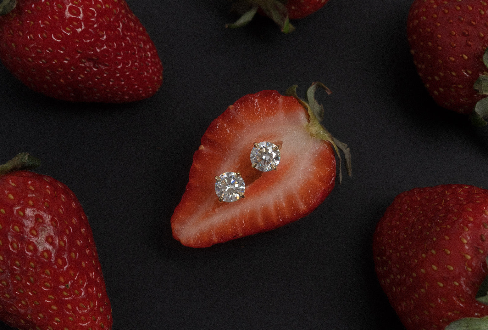
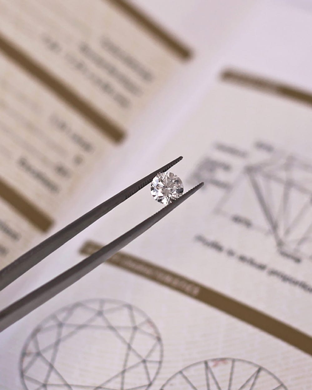
A: To achieve both beauty and durability, I employed a combination of setting techniques carefully selected for their strength and aesthetic appeal. The pave setting was used to create a delicate, continuous sparkle by closely setting small diamonds together, which also helps secure the stones firmly in place. Finally, traditional claw settings were used where necessary, providing strong support for the larger gems and ensuring the ring can withstand everyday wear without compromising its elegance.


The Painter: Keelie
Q: How did you approach capturing the piece through paint, talk us through the process of painting such an intricate piece like this?
A: Painting our lovely golden South Sea pearl was a challenge. It is something I haven’t painted on such a grand scale before, and capturing the stone’s rare beauty was quite difficult. In my home studio, I have quite a few stone charts, and I use these to help with colour references for gemstones and apply many layers to achieve the dimensional look of the gemstones. The process takes patience and careful observation to get the depth just right. I am always experimenting with new techniques and developing my skills over time.
Q: What were some of the challenges you faced when translating a three-dimensional ring into a two-dimensional artwork?
A: The trick to painting jewellery is shading and paying close attention to how light interacts with the metal and gemstones. I love painting gold, especially yellow gold. It is incredibly satisfying to work with. This piece was especially fun because the gold has not only texture but also large, rounded curves in the petals. Layering colours of yellow, brown, and white creates depth within the piece, bringing out its dimensional qualities. Although the design is two-dimensional, with the right use of depth, highlights, and shadows, I can make the painting truly pop from the page. Capturing the way light plays across the surfaces and textures was one of the main challenges, but it is also what makes the process so rewarding.


This bespoke LifeFlight Gala ring beautifully embodies both artistry and purpose. Meticulously crafted with a stunning golden South Sea pearl and vibrant gemstones, it reflects the gala’s radiant gold theme and the life-saving mission of LifeFlight. Beyond its exquisite design and craftsmanship, the ring symbolises community spirit, resilience, and hope. It stands as a timeless treasure, celebrating elegance while supporting a vital cause that touches countless lives across the region.